What I love most about helping people fall in love with their houses again is purely nothing less than instant gratification. I love seeing change happen quickly.
Sometimes there are those projects who, for one reason or another, must age like fine wine. They happen over time, which makes them taste much sweeter.
It’s even more gratifying when you go on a wing, a prayer, a Pinterest page, and 3 pictures. Well, really two pictures.
I’ll explain.
The homeowners had moved from another state, sold most of their furniture, rented a house, then bought a new house that they really liked but didn’t feel like home. Except for two pictures, which she loved. And a Pinterest page with ideas for their future dream home.
Tammy said, “My husband says I’m a brown and green girl, that all I ever pick out is brown and green. So I want to do something different than brown and green.”
“Oh, and I want two statement lighting pieces: one in the Dining Room, and one in the Master Bedroom.” She was very demanding. 😀
“I can work with this,” I said.
And so, one sunny afternoon, I brought my fan deck with all my paint colors and sat in their empty living room with those two pictures to get to know them a little better. (When you pick paint colors, it’s best too choose them in natural, bright daylight to see their full effect.)
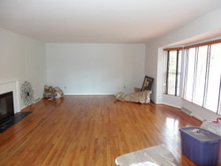
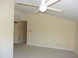
This would be the empty living room.
The pictures and I hung out and stared at each other for a while. After a time, colors seemed to pop out. After all, when you have great art, you want the colors to POP. Otherwise, why would you have it anyway? But I digress.
Home should be a sanctuary; a place you come to at the end of the day where you can regenerate, recharge, refill your batteries, and prepare to be Your Best You the following day.
Here we had a busy executive and a stay-at-home dad with two small toddlers. What that said to me is the house needed to be warm and soothing yet also child friendly. Tammy wanted it to have a Southern flare, so they all felt at home. And it needed to be neutral and have appeal for resale, because they knew they wouldn’t be in Kirksville forever. And above all…it needed to be easy to clean.
Since we knew they’d be moving and the likelihood of them finding a home JUST LIKE the one they were in were pretty much…well…zero…I tried to choose as many pieces as possible that would multitask. Meaning they could be universally used in other rooms in the house.
And did I mention it needed to be child friendly? With easy clean fabrics that would endure the many critical moments in a toddler’s life when they HAVE to leap with a single bound from that chair/step/insert whatever here or build that fort or race with the speed of light?
Believe it or not, they do make such things. 🙂
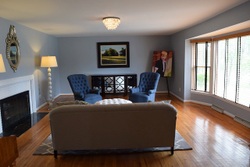
The only lighting in the living room room were meant to be floor lamps attached to plug ins. Soft lighting such as what comes from lamps is wonderful, and a very important part of the Cozy Factor in a home.
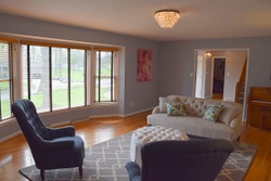
However, insufficient light is a common problem in larger rooms, so we added that beautiful crystal ceiling mounted light. (It’s the kind of light that makes you want to play with the crystals, so it’s probably a good thing I can’t reach it. I have simple needs.)
We centered the light between the fireplace and the bay window. Can you visualize the street view with beautiful light fixtures in the living room and entry sparkling through the windows and door? Breathtaking!
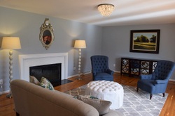
Fireplaces are typically focal points in a room, and with it’s location opposite the bay window, we arranged the furniture so guests can enjoy both. The ottoman can function as additional seating, and if Shane wants to have the guys over to watch a game, he can easily move the TV on top of the buffet and bring in extra chairs. Shazam!
We also added to the fireplace’s functionality as a Focal Point by accenting it with a fabulous mirror and mother-of-pearl lamps. The lamps can easily be moved over near the chairs or love seat for task lighting, and the best part is these items will also go with Tammy and Shane when they move. Literally, these lamps could be used in any room!
When you have a room that is working in perfect harmony, it is like a piece of pie: until it’s whole – or complete – it feels like there’s a piece missing.
(Speaking of pie…if you’ve never had Southern cooking, you are missing OUT. I’m just saying.)
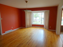
Here’s the dining room before.
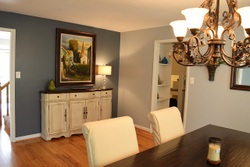
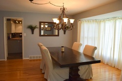
And, here’s the after. When it all comes together, you have a WOW.
We swagged the light fixture to move it out of the center of the room and to allow for better traffic flow between the adjoining rooms. That fabulous buffet from Surroundings (yes, really!) provides lots of great storage but doesn’t overpower the room or interrupt traffic flow.
We chose this beautiful table from Pottery Barn paired with the durable and easy-clean slip covered chairs that are dressy enough to function as additional seating in the living room, and this room is ready to go.
Shoot, I’m not even Southern and I love this room. (But then I’m biased, of course.)
Those of you who are mathematically inclined (which would not be me) may have realized that I mentioned THREE pictures earlier in my post.
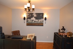
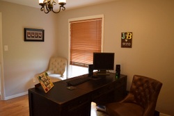
Well…the den was really basically finished before the third picture was purchased, which was the inspiration for the whole room. I had Shane add sconces on the back wall which match a wrought iron chandelier. We added a COOL trunk-style bar cabinet and desk from Pottery Barn.
When Shane and I were talking about his vision for the den (his Man Room, as every man should have), and he mentioned an awesome picture he’d seen at our local Red Barn Arts and Crafts Fair.
I knew exactly which one he meant, because I drooled over the same one.
My friend John McMurry of McMurry Studios is a terrific photographer who specializes in landscape canvases. His Wheatfield print was perfect for a guy who’s a night owl with a rustic western style.
The key to having each of your rooms harmonize with each other is having paint colors from the same color family or that have some commonality and having one element in each room that ties them together.
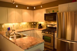
 The kitchen had been updated and, while very nice, was a little on the bland side for this homeowner. It lacked Wow Factor.
New paint, a beautiful stone backsplash (which is not green as it looks in the picture) and a very neutral, textured laminate counter top gave it pizzazz.
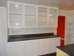
The glass front cabinetry offered lots of great display space, as you can see in the Before picture, above.
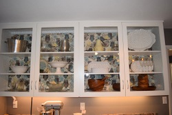
Because this homeowner didn’t have a lot of colorful collectibles, we chose some colorful fabric which is wrapped around foam core (or a similar material) for an attractive background which really sets off the items she has. And…it’s easily interchangeable!
Shane also added counter top lighting, which really added to the space. (Fortunately, he’s an electrician by trade, which came in handy in this house!)
The large master bedroom offered a huge closet, negating the use of a dresser or chest of drawers. So we were able to focus on the Master as a real sanctuary. Pictured is the south wall of the bedroom before.
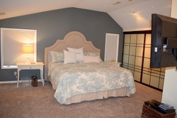
For those of you who can’t imagine a bedroom without a ceiling fan, you should know that the fan wasn’t positioned above the bed. That opened the door for the beautiful statement lighting piece, with matching sconces. (The wall paint is a creamy white, and not yellow as it looks in this picture.)
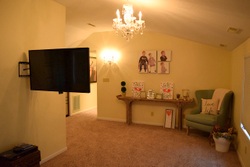
A reading nook in which to relax or cuddle toddlers among favorite things is a perfect way to end, or begin, the day. Of course busy parents need a place to relax in the evening, so Shane installed a TV on the center wall, which is actually the fireplace chimney. (They had it drywalled to cover the brick to make it child friendly.)
A soft, restful gray-blue color accent wall makes the headboard and bedding POP and helps unwind and soothe, which is a necessity for restful sleep.
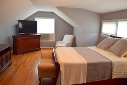
Last, but not least, we updated the Guest Room.
It’s now a welcoming, spacious place for guests to stay. We were able to use several pieces Tammy and Shane already had, re-purposing them here and making the space cozy.
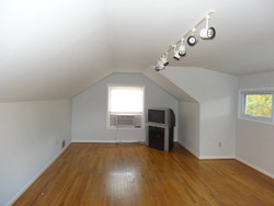
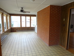
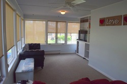
They planned to use the sun room as a playroom, so this space needed to be fun, child safe, and still coordinate with the rest of the house.
I think we succeeded. New drywall, paint, lighting, and easy-care carpet squares gave this room the new life and durability it needed. The light blue ceiling gave the space an airy feel.
That’s the beauty of what I do: giving a space new life, helping you – and the room – live in harmony with each other again, where ever that is. 🙂
Cheers, my friends!

