This was a case of a family who loved the house they were in; they were Beth was just ready for a change. 😉 What they needed most was someone who could objectively give them some ideas and to help keep everyone’s stress level on the manageable side. That’s where I came in.
When you’re living in the midst of a home remodel, it can be very stressful. I managed to stay married and speaking to my husband after several of them, so I know it can be done. Although I can neither confirm nor deny that there may, or may not have been, meltdowns which occurred during the process. HA
Sometimes, just simply getting started – or knowing where to start – is the overwhelming part!
So without further ado, here’s the scoop. 😉
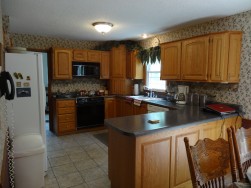
If you looked at the photo album on Facebook, you know this is the kitchen before.
Beth and Bobby actually remodeled the kitchen ten years ago when they moved in. They were Beth was overall pretty happy with the kitchen, just wanting it painted and a new backsplash.
Beth has a clean, uncluttered style without a lot of extra stuff. (When I say a ‘clean’ style, I’m not referring to the state of cleanliness of her house – although she is that too! – I’m actually referring to the fact that she prefers ‘clean lines’, without ornate styles or patterns.)
What amuses me about this picture is two things: the wallpaper actually makes the kitchen look cluttered. And, you don’t really notice the cabinetry; you notice the wallpaper, and the white fridge.
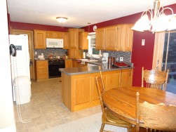
The rich, beautiful color is now the focal point of the kitchen. You may notice one other small change: during the remodel, her microwave died, so she switched it out for a matching white one. Now if that stove would just die… 😉
Because successful marriages always involve compromise, we ‘blended’ their favorite colors for the accent walls. Bobby loved burgundy; Beth loved red. So we looked for a modern combination of the two, and found Behr’s Wine Tasting. While it looks a little more red in the photos, it’s a little lighter than a nice Merlot.
Beth and I joked that we would never forget the name of the paint color. And then I forgot it. But that’s probably because I drink white wine.
Beth chose a multi-color gray glass tile backsplash. They are small tile pre-set into 12 x 12 sections, so you don’t have to apply one small tile at a time. This dramatically changed the look of the kitchen, and ties together the countertop and the existing gray tile floor.
Because there was very little open wall space in the kitchen, we painted all three walls. Not only did it make their cabinetry POP (she’s been asked if she got new cabinetry!), but it also makes the kitchen look much brighter and warmer. Their new French door now makes a beautiful picture frame for their very pretty back yard.
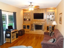
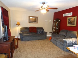
I think the most dramatic change is in the family room.
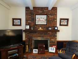
Beth’s instructions to me were to leave the fireplace as is, or maybe paint it; they were going to eventually tear it out someday – if they added on the back of the house – because they had not been successful in getting it to work properly.
I couldn’t stand it. Fireplaces add value to your home; the minute you tear one out, you’re taking value away. Besides, think of how many family memories are created around a fireplace! Stockings at Christmas, a mug of hot cocoa in the winter, curling up in a cozy chair with a book and a glass of wine (wait, maybe that was me), etc.
Fabulous!
The ‘Bamboo’ laminate flooring and the oak cabinet-grade built-ins (built by Dwayne Lawson) completely transformed the room. The room only had the one window, so we added lighting in front of the cabinetry. These, and all the other walls, are Behr’s Pecan Sandie.
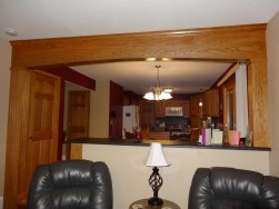
Or maybe the archway is my favorite.
If they removed this whole wall, they would lose the wall space, and the ability to place furniture there. I suggested several ideas, and showed them some examples. Reid sketched their favorite; now they wondered how they lived without this counter all these years!
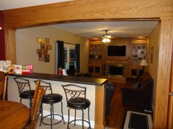
I love the bar stools! And now you can have a snack or be in the kitchen and see the TV, or just simply feel like you’re a part of everything!
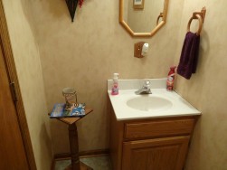
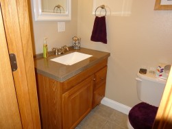
The bathroom was made much more spacious just by simply reversing the swing of the door. It had quite possibly the leetlest vanity I’ve ever seen! We replaced it with a larger one that made sense in the space and dressed it up a bit.
And the wallpaper went away.
Now, a downstairs bath that’s proud to meet guests, no matter which side it sees. 😉
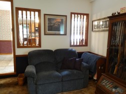
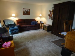
And then there’s the living room. Maybe that’s my favorite.
We took a room with no clearly defined purpose, and gave it a new life.
Several years ago, the family lost their finished basement, which served as a family room, to a flood while on vacation. They were down to one TV room, and the living room was being used as a computer room and office.
Fabulous! The bamboo floor is also in here, with a large area rug to make it cozy. Reid added an overhead light and cable, and now this has become daughter Katy’s favorite room to do homework.
The accent wall not only gives the room its Wow Factor, but it will also look fabulous from the outside. (Have you ever thought of how your room might appear from the outside?)
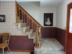
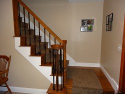
And the new spindles on the stairway? What a fabulous change that is! Reid ran the bamboo up the stairs, but added a carpet runner, which will really make it easier to clean. Fabulous!
What.A.Difference.
And did I mention that the top of the railing and the main post stayed the same? It looks fresh, clean and uncluttered. Traditionally modern. 🙂
One thing I didn’t mention is that we also switched out the original doors, which were flat hollow core, for 6-panel oak doors. Reid did a terrific job of matching the other woodwork. They say life is in the details, and a remodel is no different. Updating the doors made a huge difference.
If you want to see a little more realistic view, you can watch the visual tour here: http://www.visualtour.com/
Thank you, Beth and Bobby. It was a terrific project, and we’re glad you love it. I had a blast! 🙂

